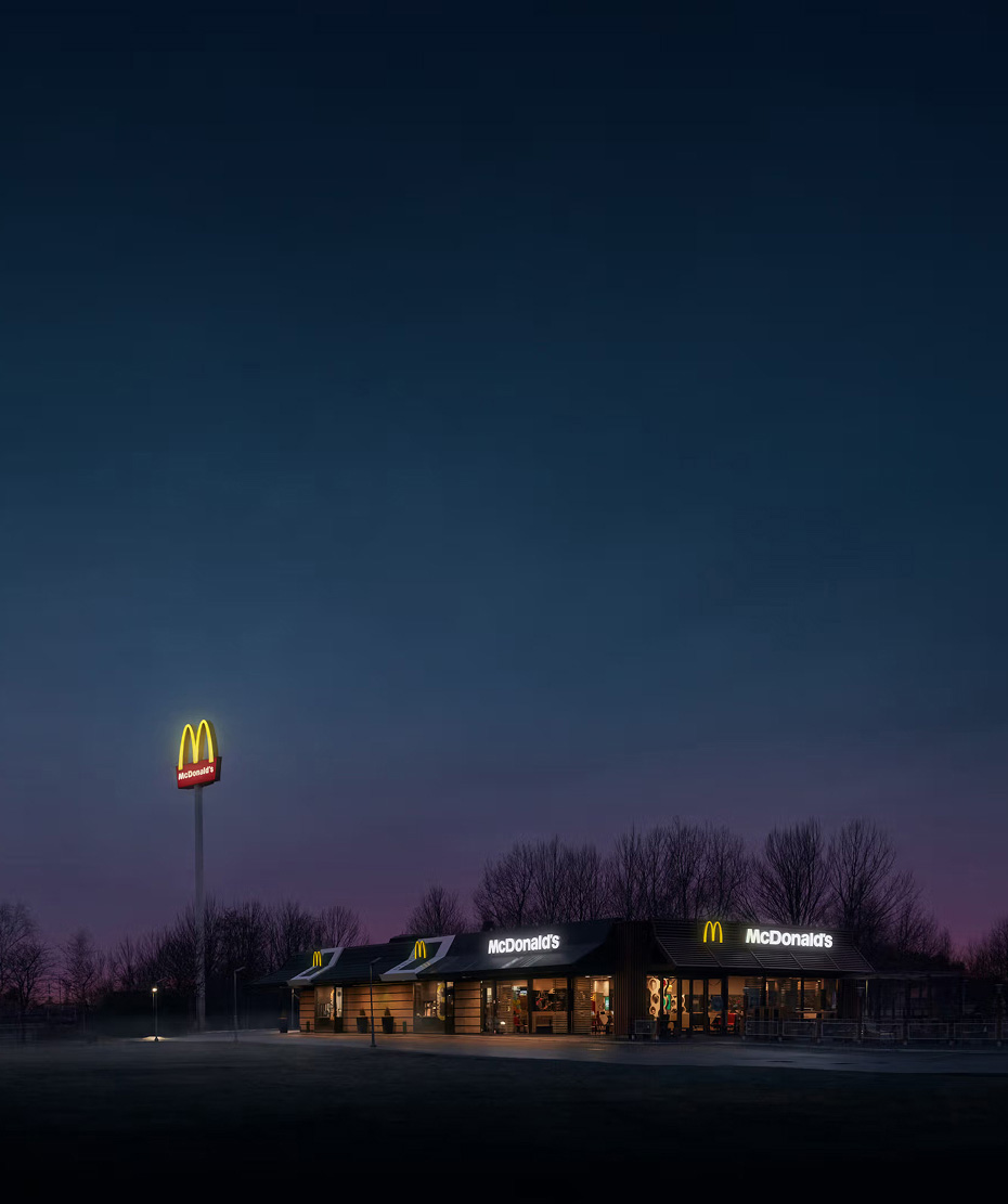
In 2018 McDonald’s performed a brand reset with the goal to clearly signal improved quality, sustainability and investments in new services. To modernise the brand expression and increase the perception of quality we developed the visual identity with a new color system, photographic manner and animated illustrations and icons built from shapes in the logotype. A design system connected to the different product ranges and price levels was defined to create a consistent quality brand expression through all touchpoints. I was leading the design work in close collaboration with design direction Cecilia af Petersens and the whole commercial team att NORD DDB Stockholm.
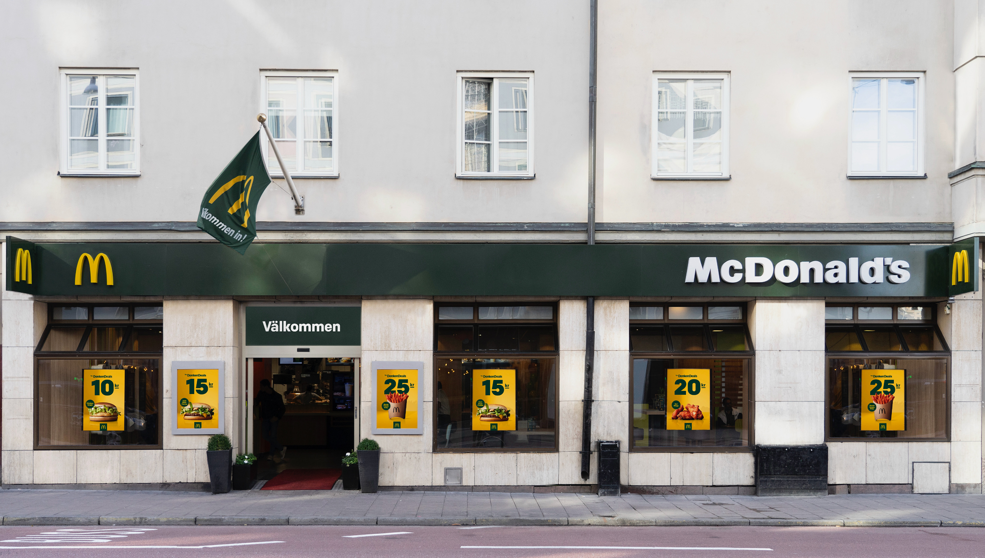
One challenge was to clearly be able to communicate the low price and simplicity of "Donken Deals", a set of clearly defined price points for small items. I developed an icon system based on the characteristics of the logotype, creating a fun and tasty icon library perfect for fast communication with high brand ID.
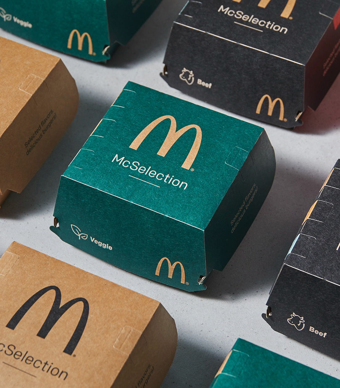
There are many levels of product categories within McDonald's. We developed a clear hierarchy, going from Donken deals to core items such as big mac to McSelection, a premium rotation of quality burgers with seasonal toppings. These allowed for a more premium packaging as well, changing the perception of what McDonald's could be.

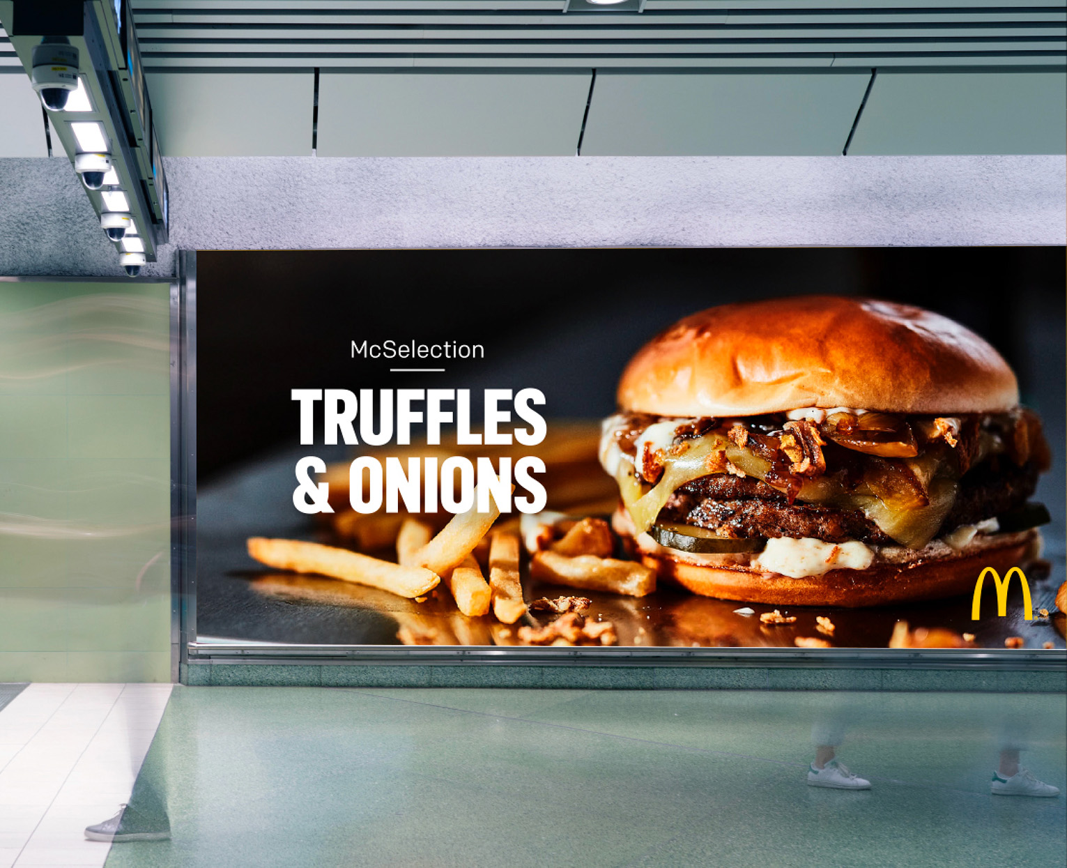
Together with the commercial team at NORD DDB we also developed a new, more premium image style used in brand imagery and brand campaigns, creating an overall more premium look but at the same time staying true to the brand.  
More work