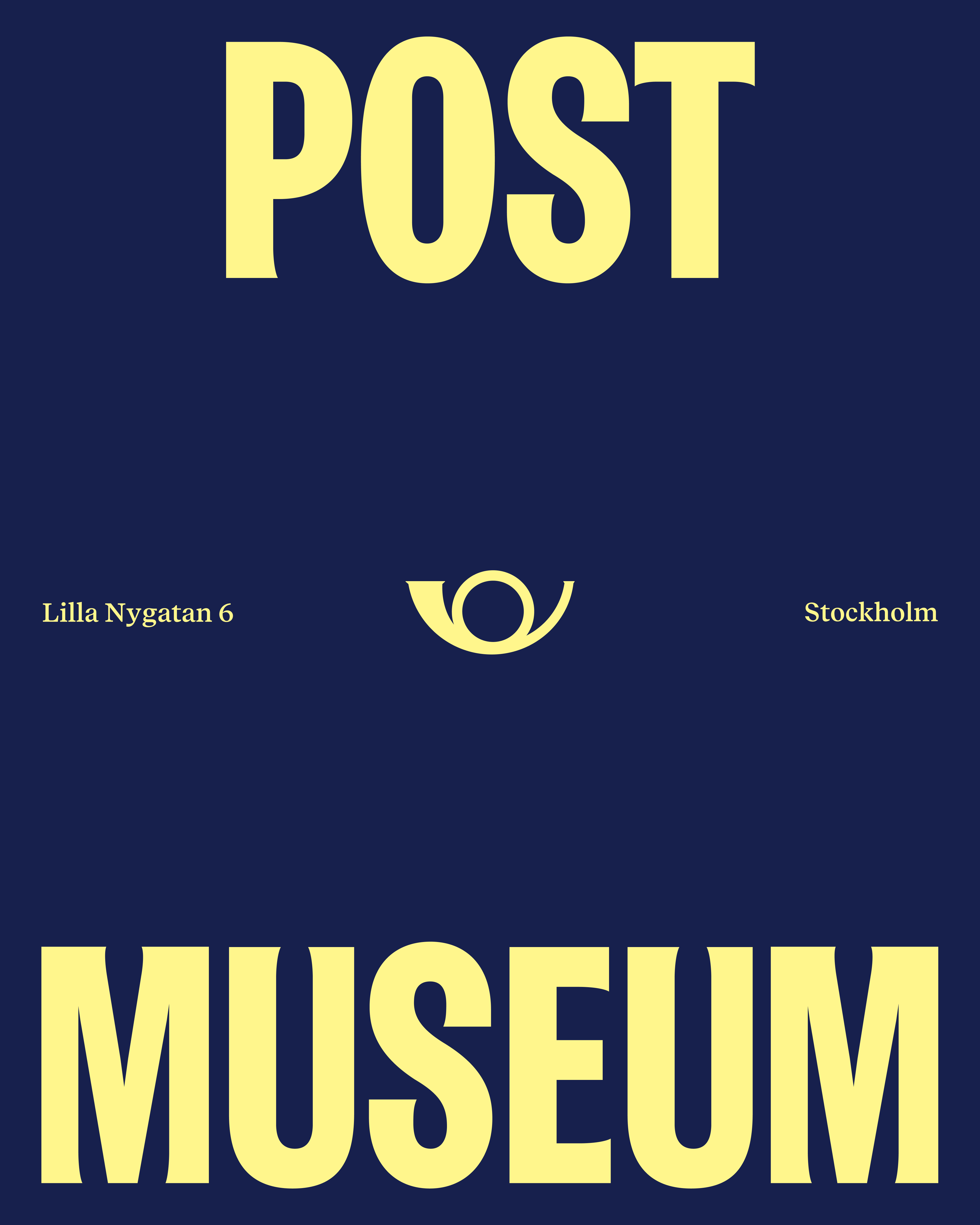
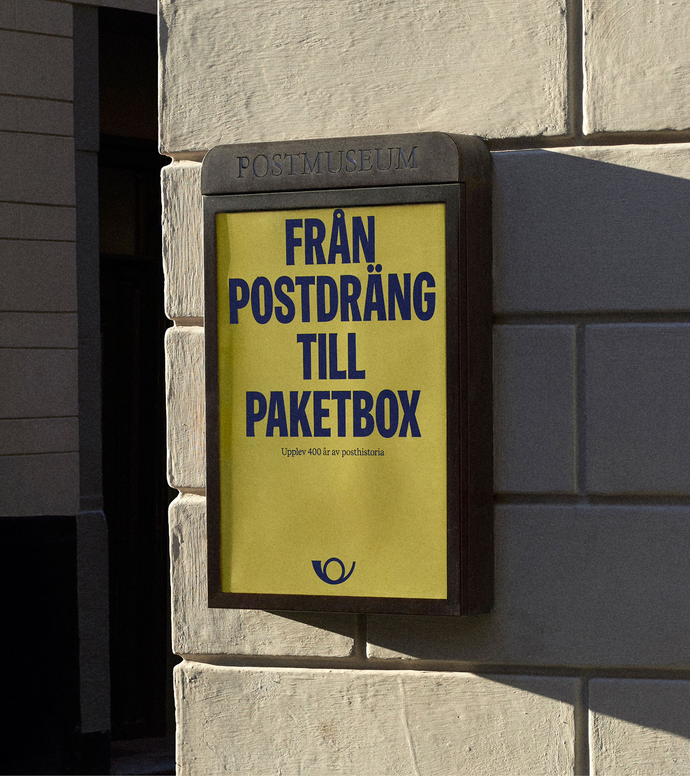
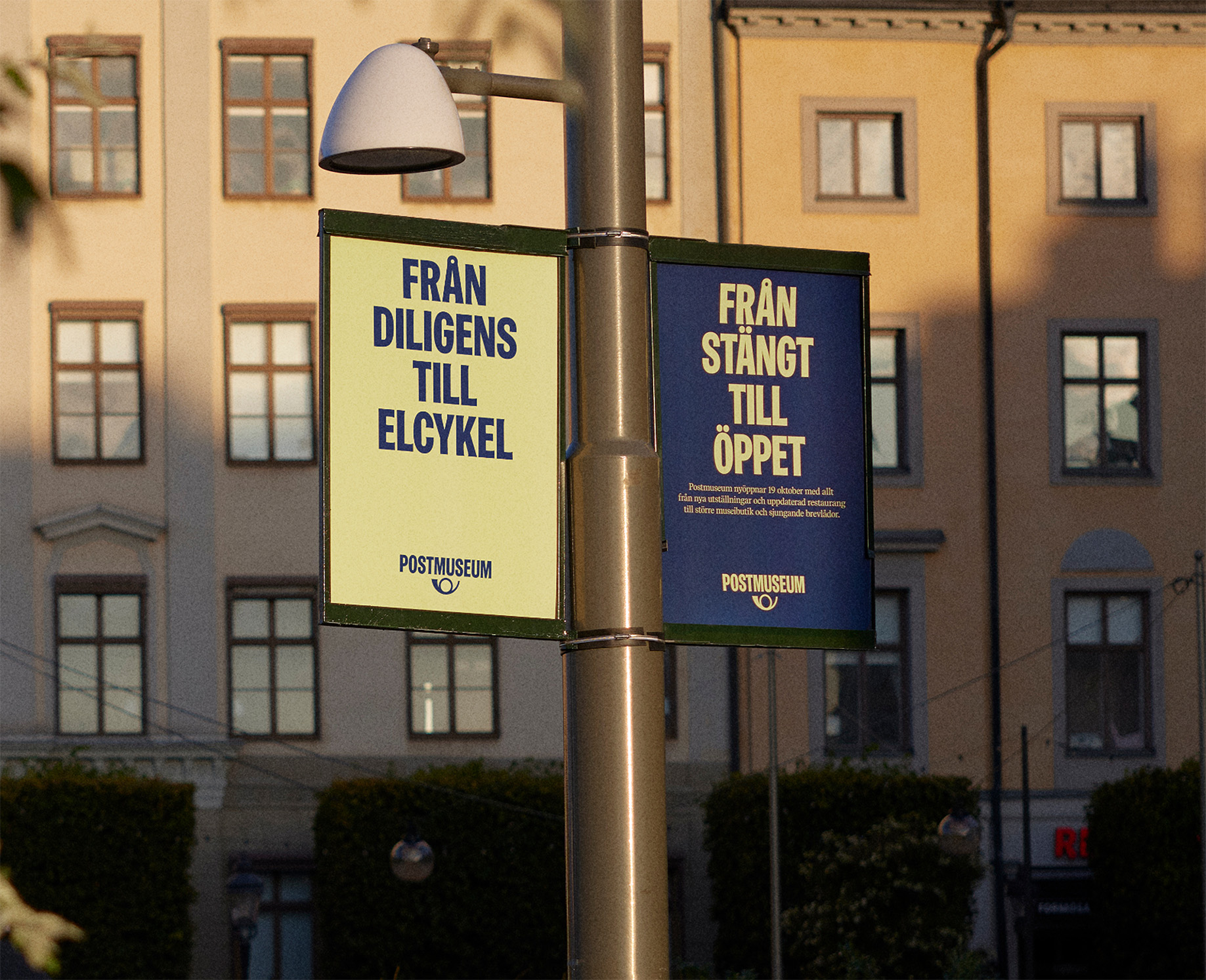
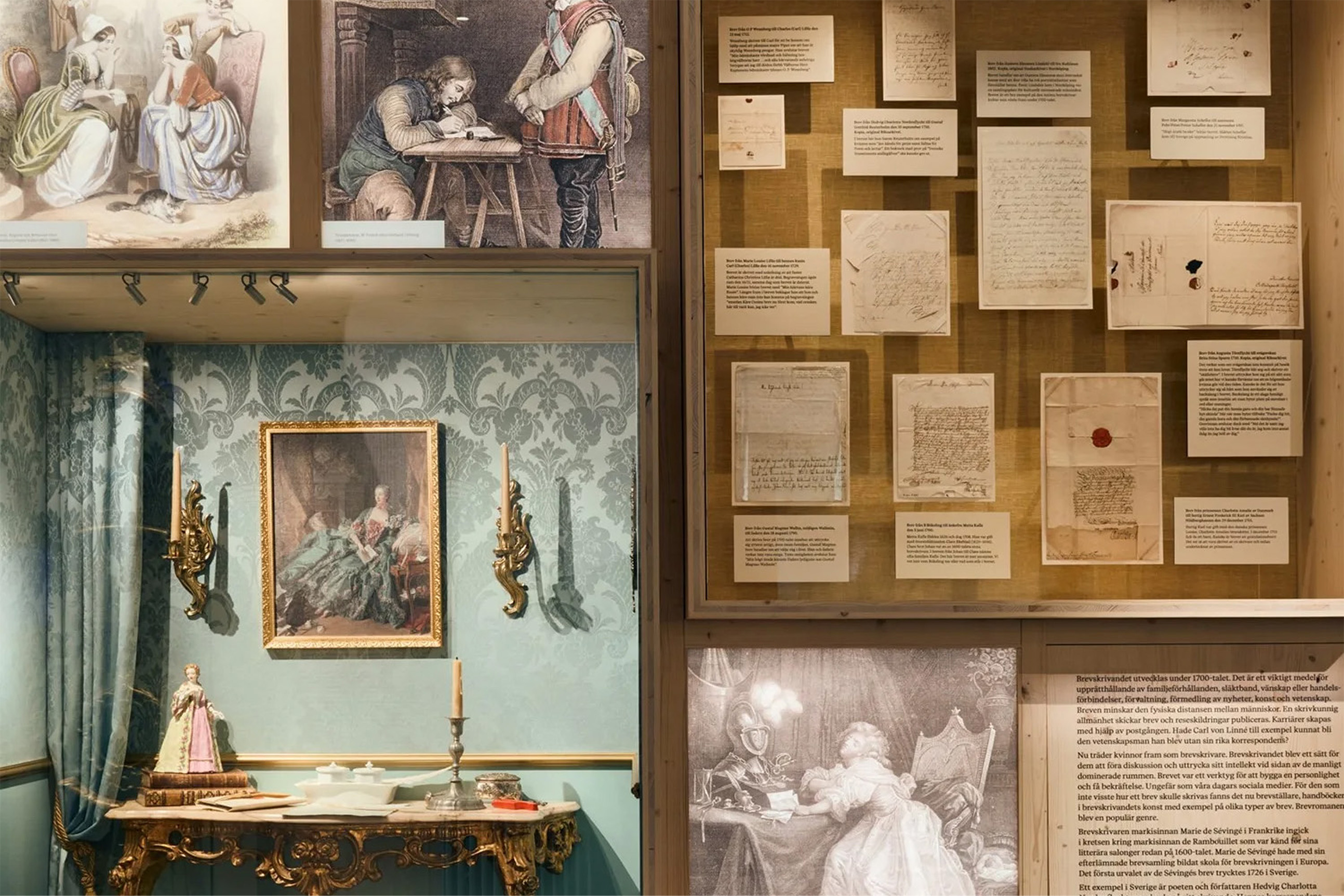
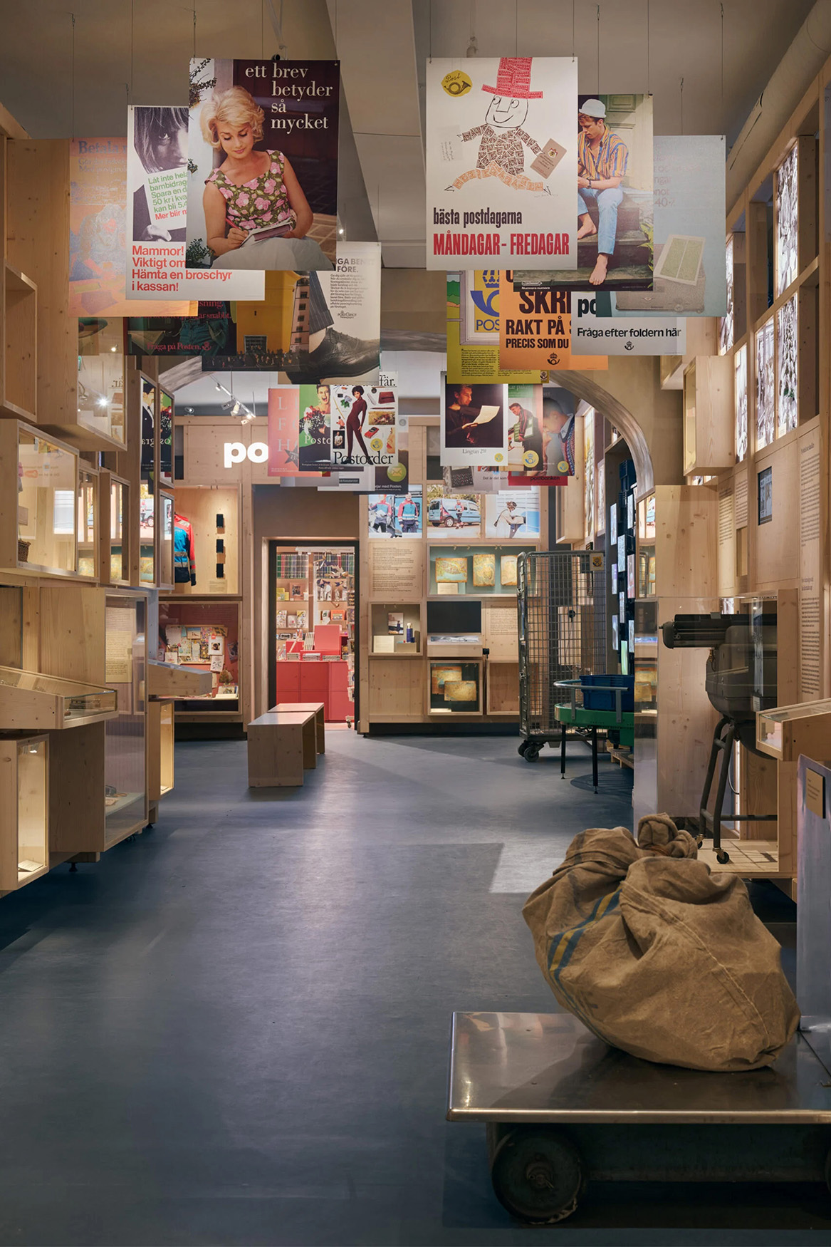
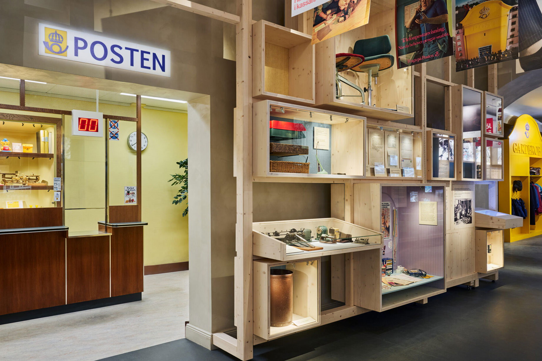
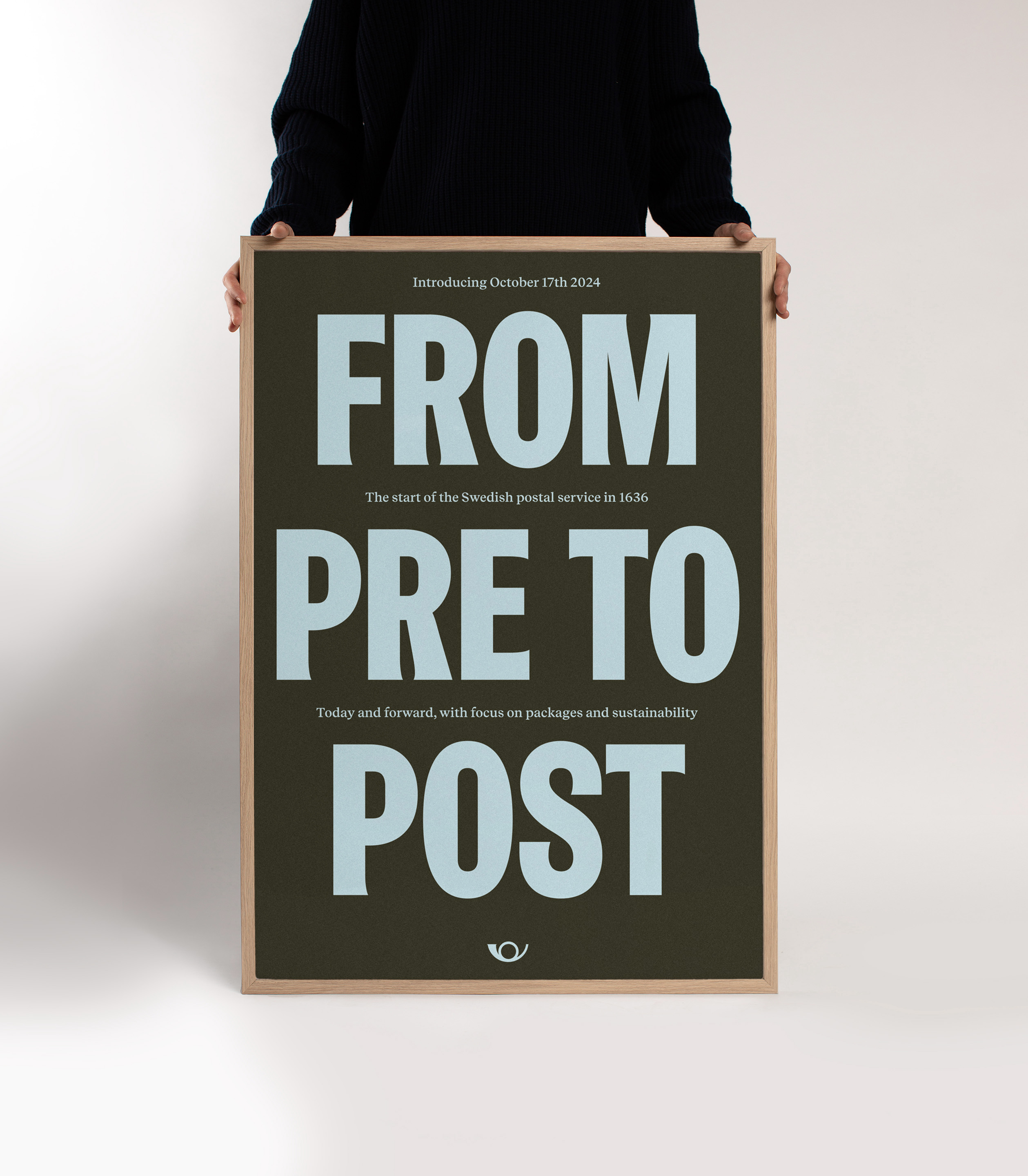
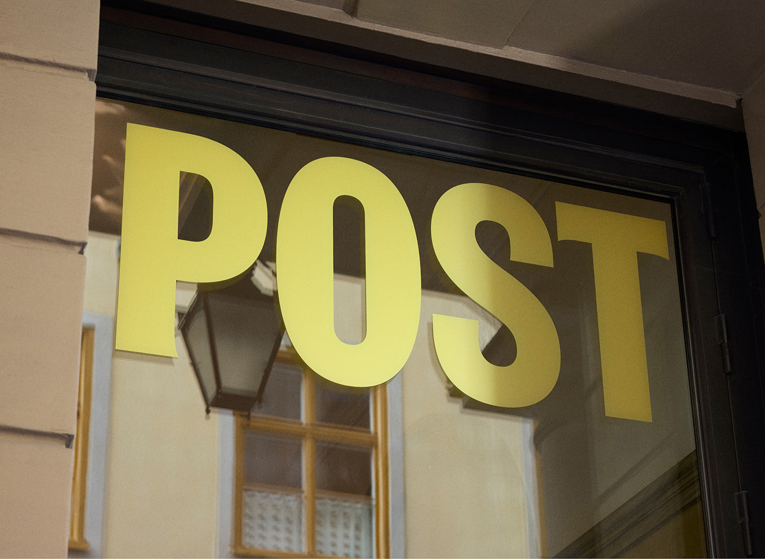
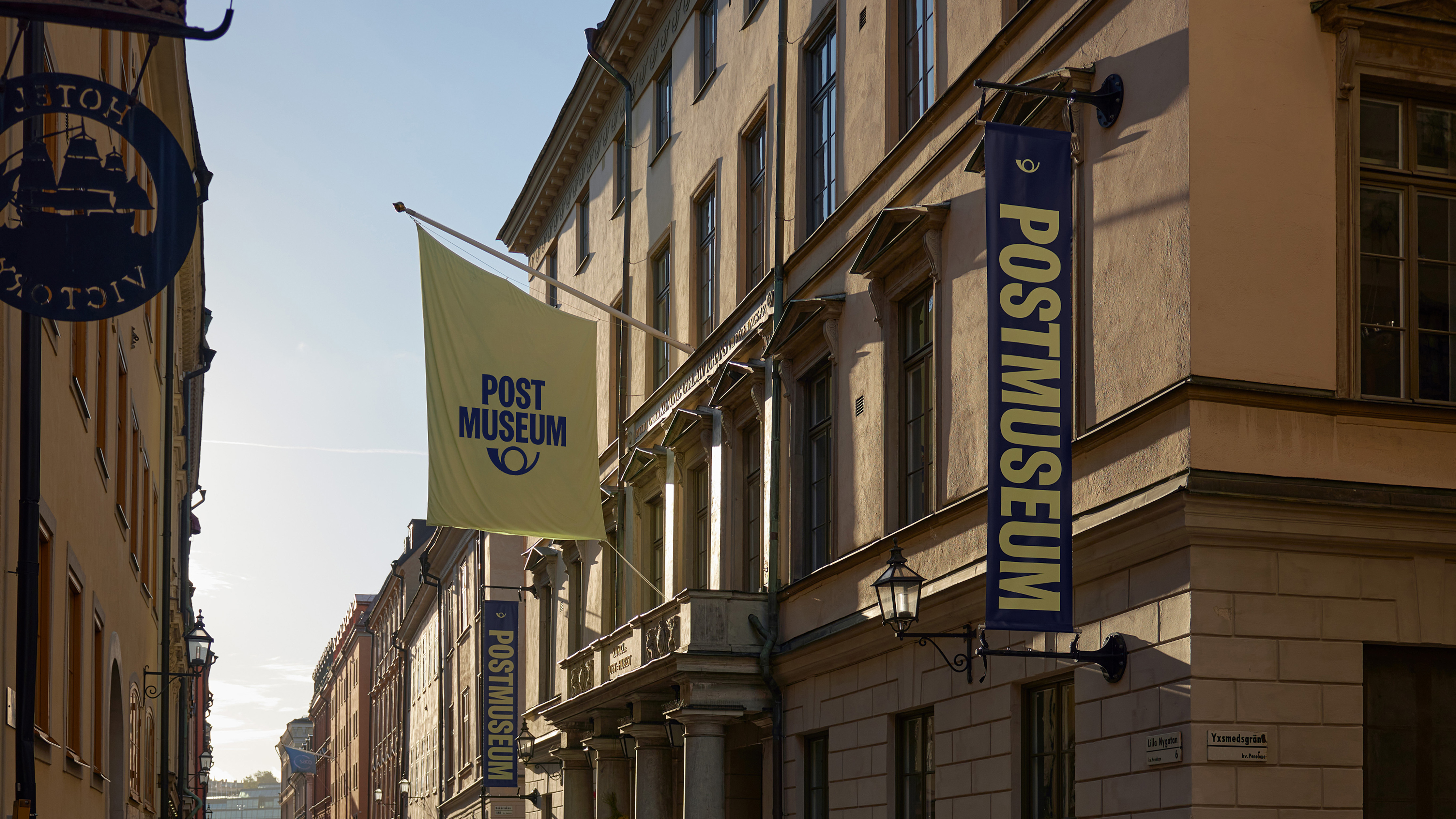
For nearly 400 years, the Swedish postal system has played a vital role in shaping the nation’s history and its journey toward a modern, democratic society. After years of renovation, Postmuseum (The Swedish Postal Museum) reopened in fall 2024 with a new identity, designed to modernize its presence and strengthen its role in Stockholm’s cultural scene.
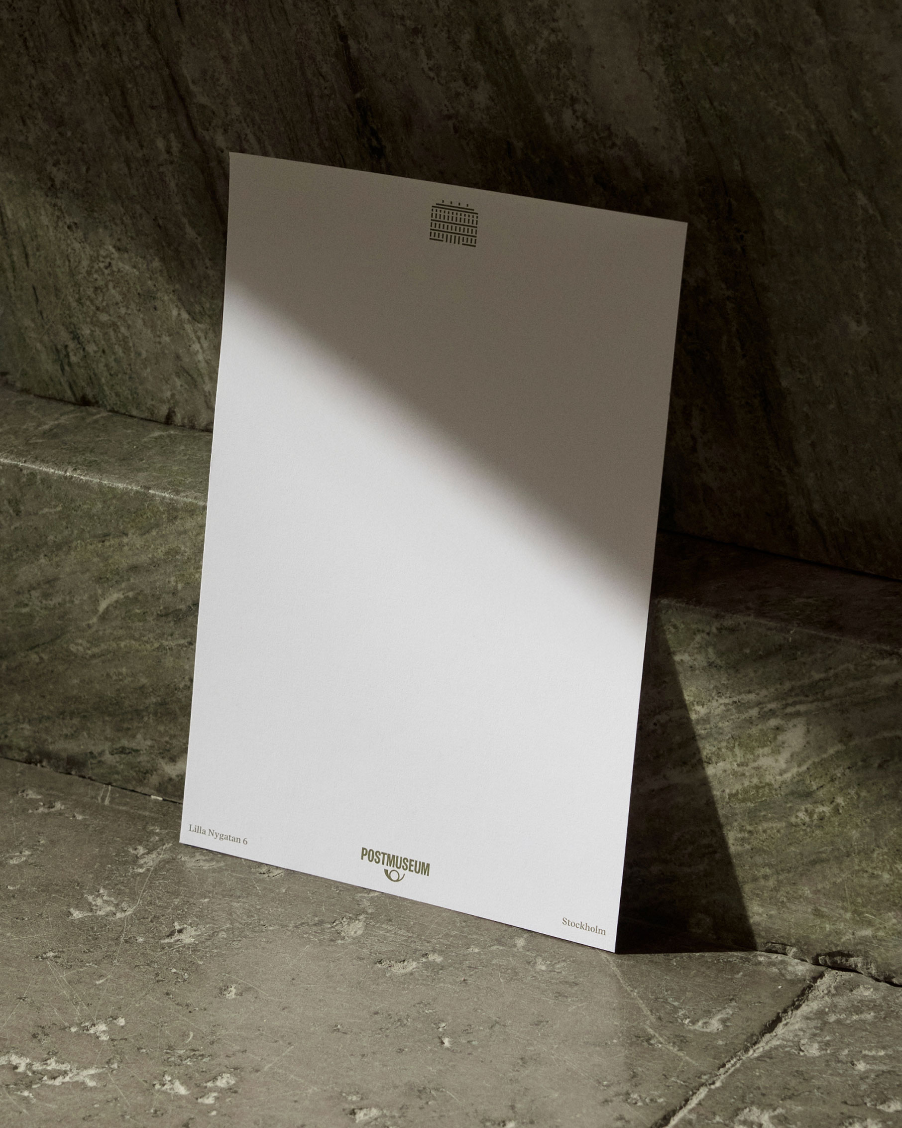
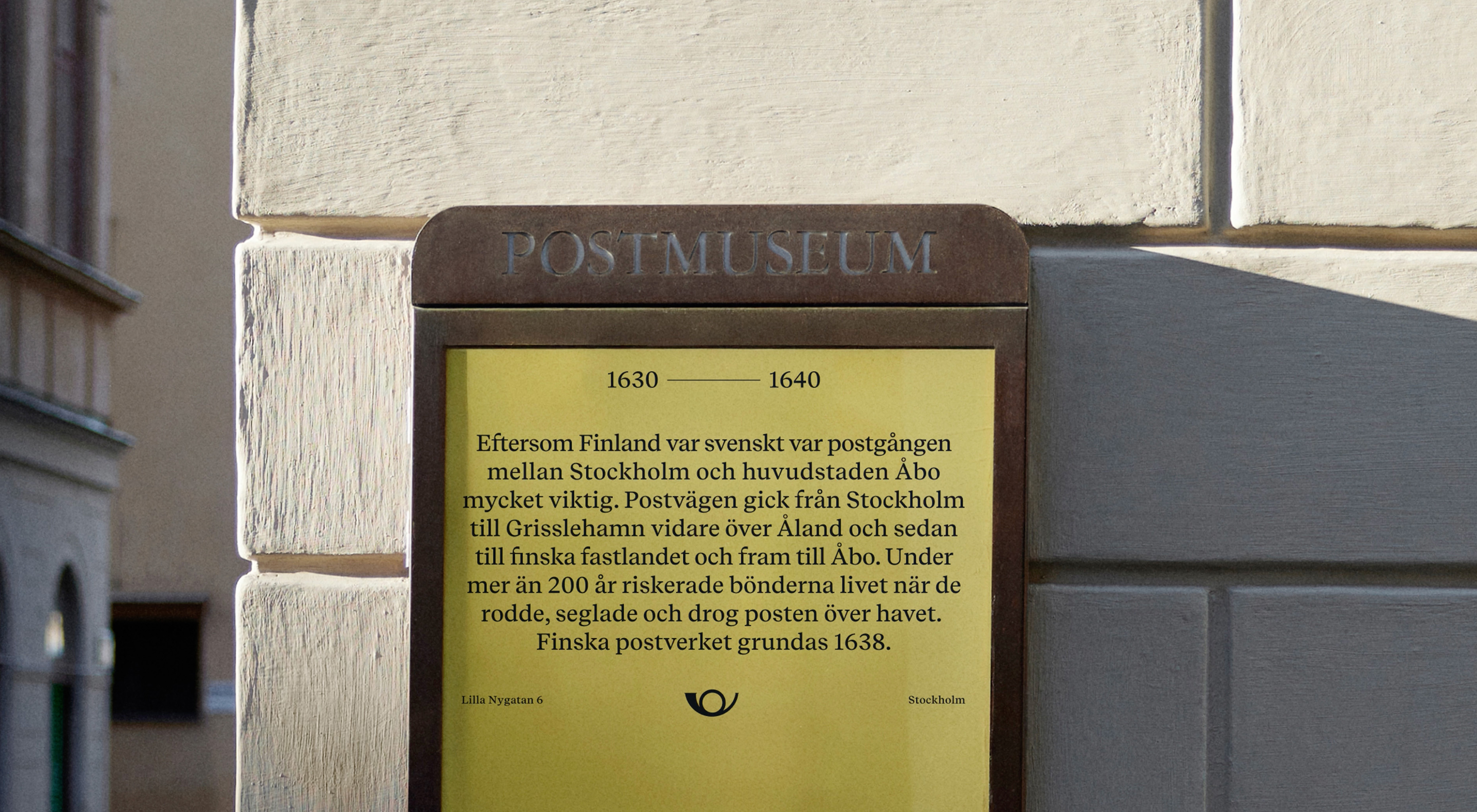
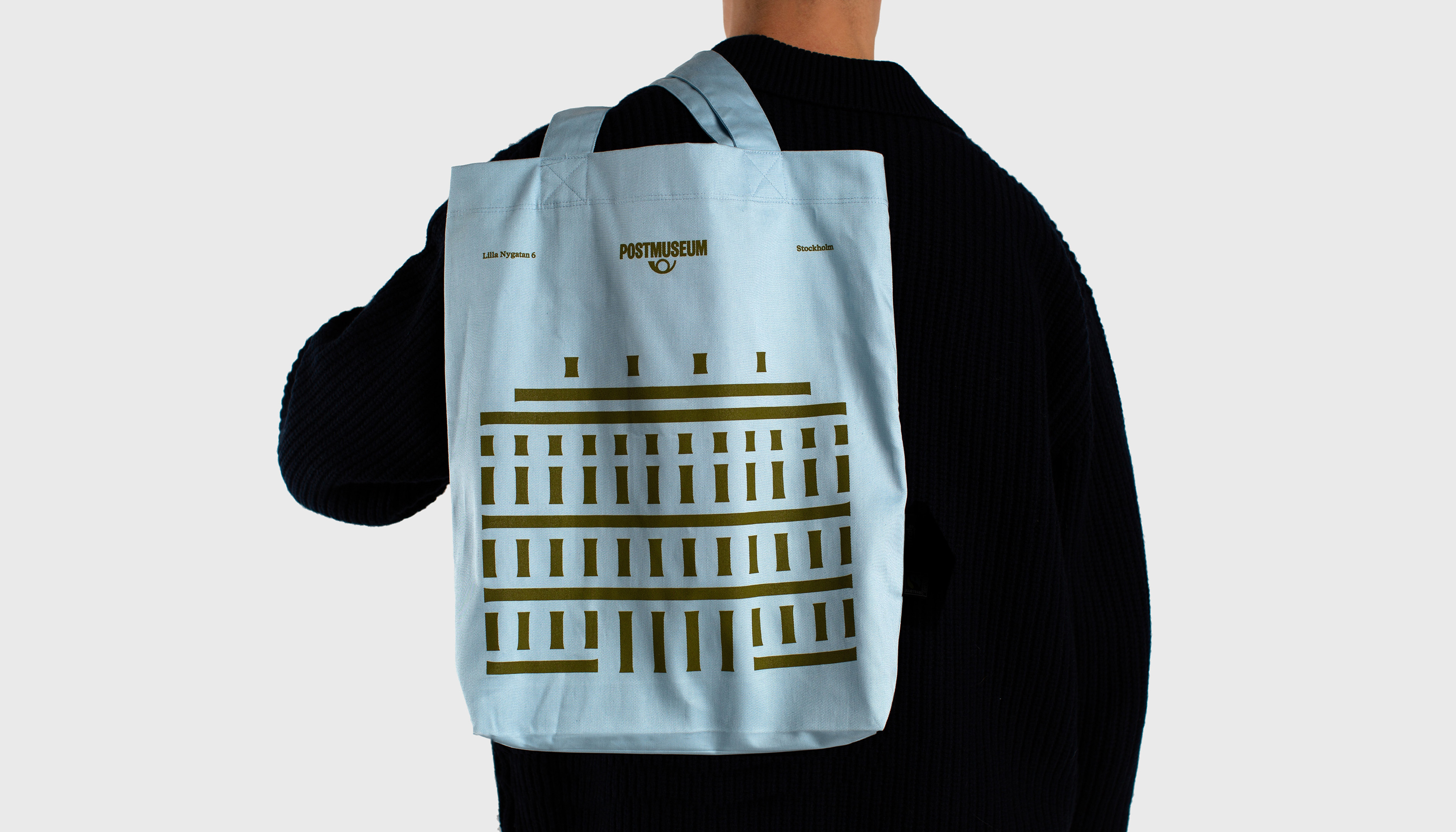
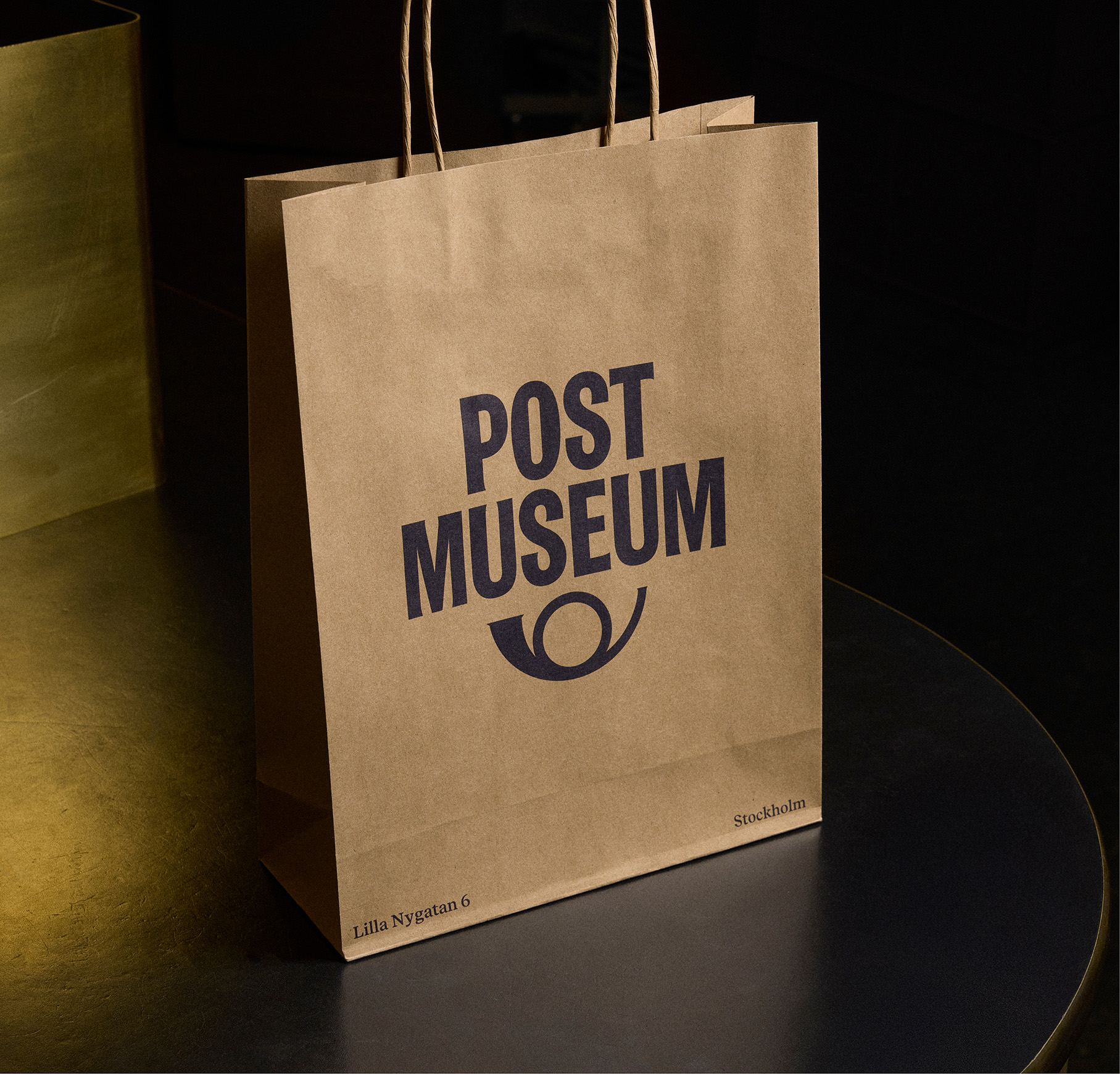
To mark this transformation, we were tasked at Bold Scandinavia with creating a new identity that would make the museum more modern and playful, helping to attract more visitors, inspire pride among staff, and strengthen awareness and perception. I lead the design work, working closely with the client and design director Jesper Nilsson Böös, going through the archives and developing the identity.


