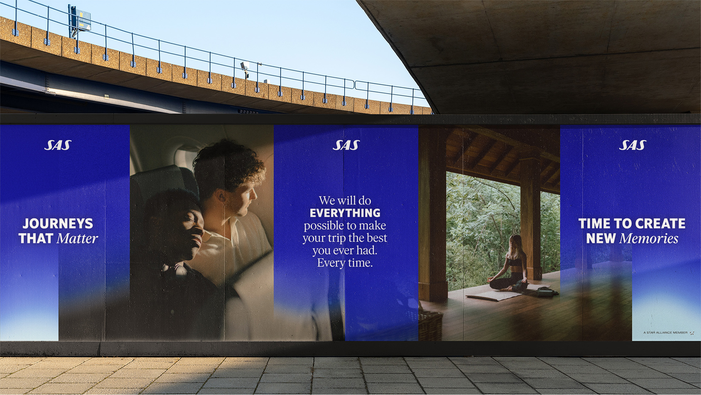
SAS is the leading airline in Scandinavia and one of its strongest and most recognized brands. As their global brand agency for more than a decade, Bold Scandinavia has covered everything from strategy and positioning to brand design, fleet livery, uniforms, packaging design, digital experiences, and much more. I joined the team to lead the 2022 design refresh, where SAS needed to shift into a more attractive choice for leisure travellers since their main target group business travellers was decreasing due to new ways of working.
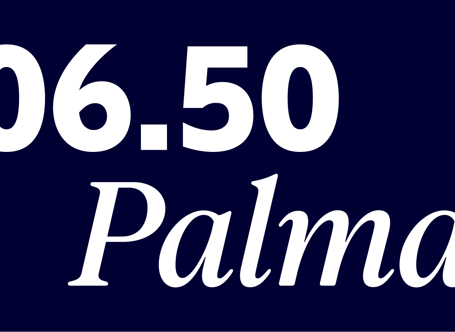
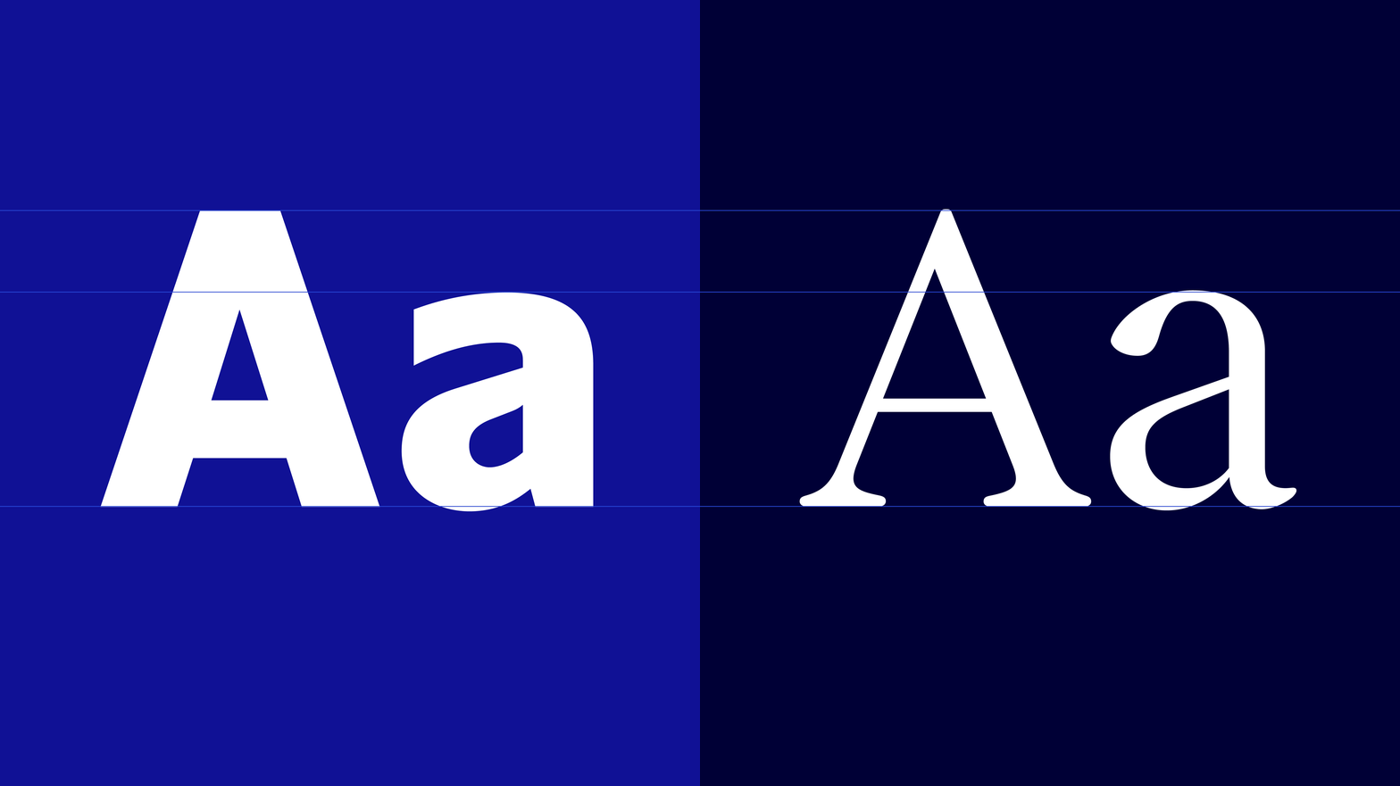
With the goal to create a stronger emotional connection between SAS and their travelers, in 2022 I worked with Bold Scandinavia to develope an updated brand strategy, story and brand identity that signals quality, care and warmth, while preserving a strong recognition to the brand’s iconic design heritage. In addition to visual elements such as a new bespoke serif font, colors and layout system, we have also developed new concepts for motion and tone of voice in close collaboration with Åkestam Holst.
The strategy was to bring in more emotionally relevant element and create an emotinall narrative around travelling to attract not only business- but leisure travellers.
The strategy was to bring in more emotionally relevant element and create an emotinall narrative around travelling to attract not only business- but leisure travellers.


