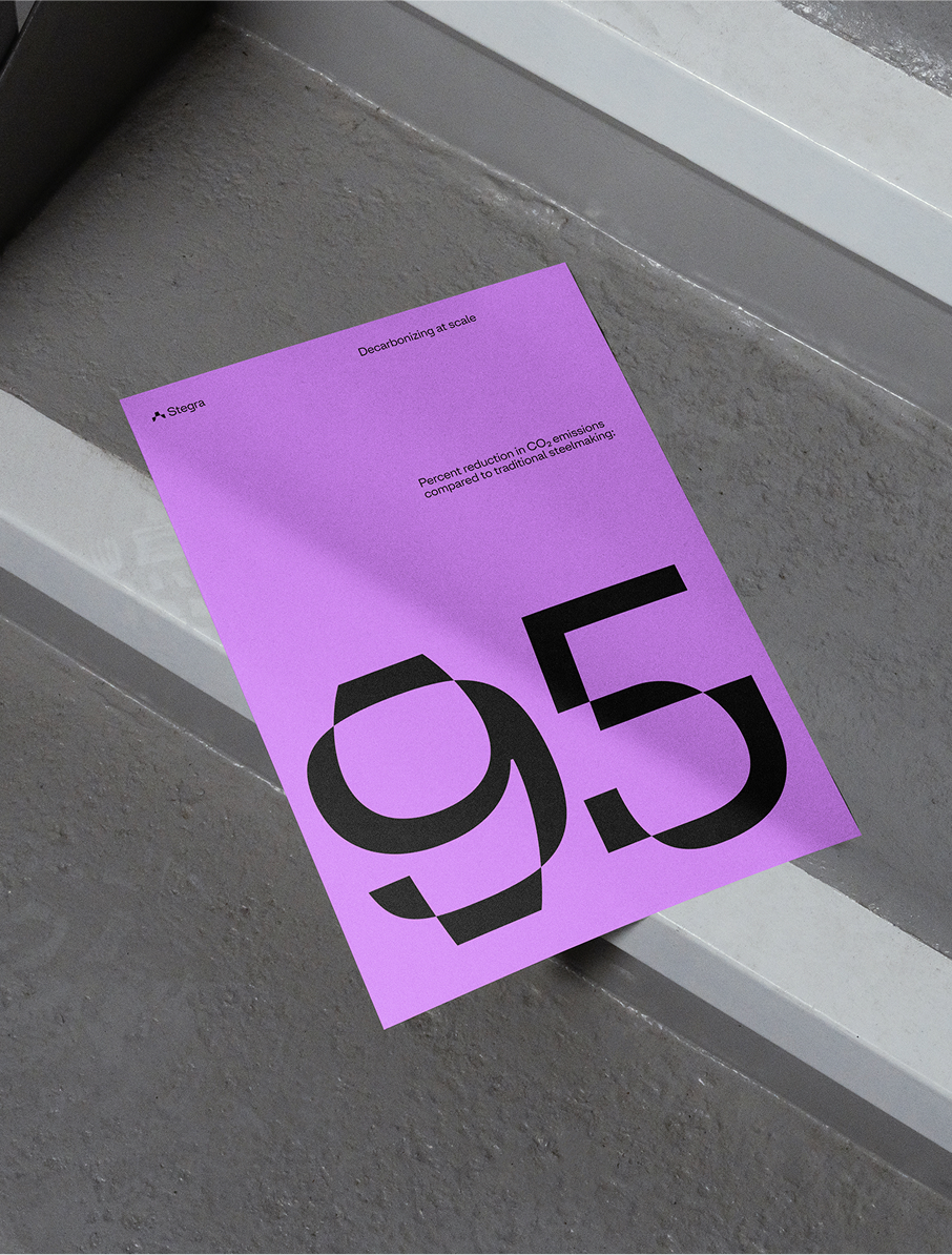
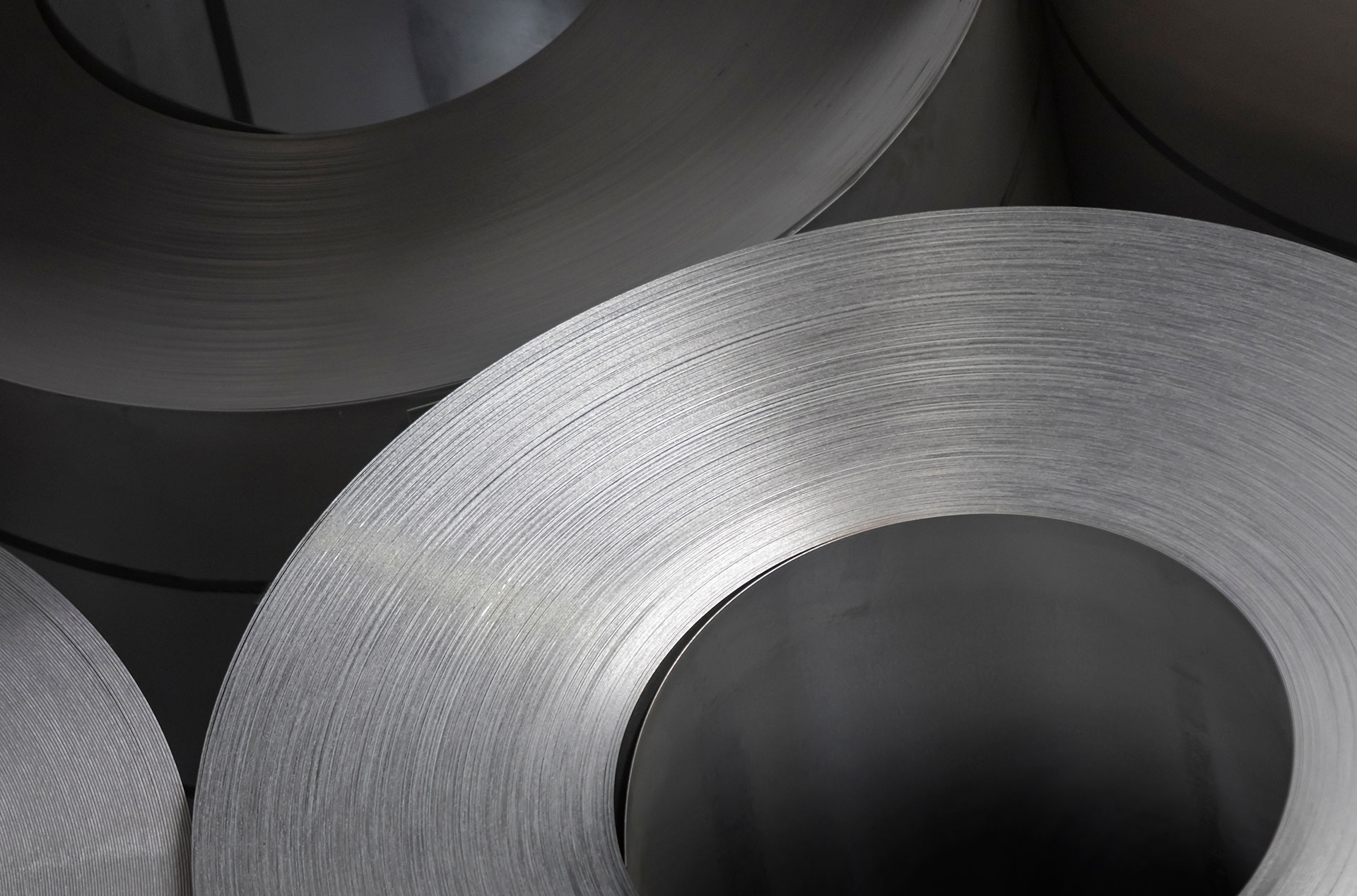
Stegra, formerly known as H2 Green Steel, was founded in 2020 with a mission to slash the carbon footprint of steelmaking by up to 95%. Responsible for 7% of global CO₂ emissions, changing this sector is critical in the fight against climate change. Since its launch, the company's purpose has been reshaped to be the accelerator of decarbonization in hard-to-abate industries.
I've been leading and directing the work from pitch to implementation during 3 years as an employee as Bold Scandinavia, collaborating with amazingly talented people. Developing everything from brand concept to bespoke type, 3d animations, brand movies, brand launch, fairs, employer branding and so on.
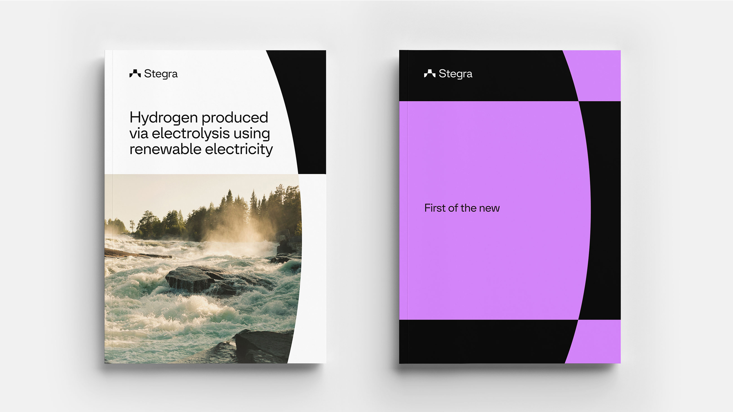
The identity was designed to convey trust and expertise, while embracing an optimistic outlook on the future. Built on the idea of constant renewal and breaking patterns, the minimalist symbol rising from its own form embodies this vision. The design DNA runs through everything, from the layout system to the custom typography, creating a visual language that breaks free from traditional heavy industry conventions.
The identity was designed to convey trust and expertise, while embracing an optimistic outlook on the future. Built on the idea of constant renewal and breaking patterns, the minimalist symbol rising from its own form embodies this vision. The design DNA runs through everything, from the layout system to the custom typography, creating a visual language that breaks free from traditional heavy industry conventions.


